RioniArt
Restaurant & Venue
A from-scratch website for a restaurant and event venue in Bremen, built to feel like an extension of the room itself: full-bleed photography, one page, no hunting for hours or a phone number.
Brief
The problem
RioniArt is a restaurant, bar, and private event space in Bremen that opened without a website: just a map pin and an Instagram grid. Anyone searching for hours, a phone number, or what the room actually looks like before booking a table had nowhere reliable to land.
I designed and built the site from scratch, end to end: structure, photography direction, and the WordPress build itself, working directly with the owners instead of from a brief handed down by someone else.
“A restaurant's website gets about one scroll to convince someone before they call, or don't.”
Design direction
What the site had to do
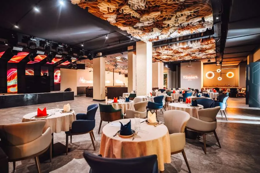
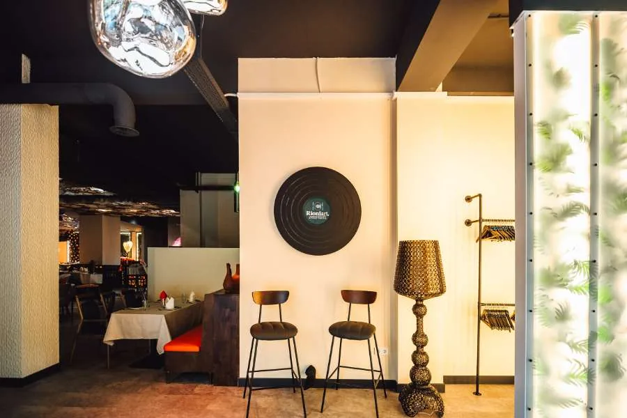
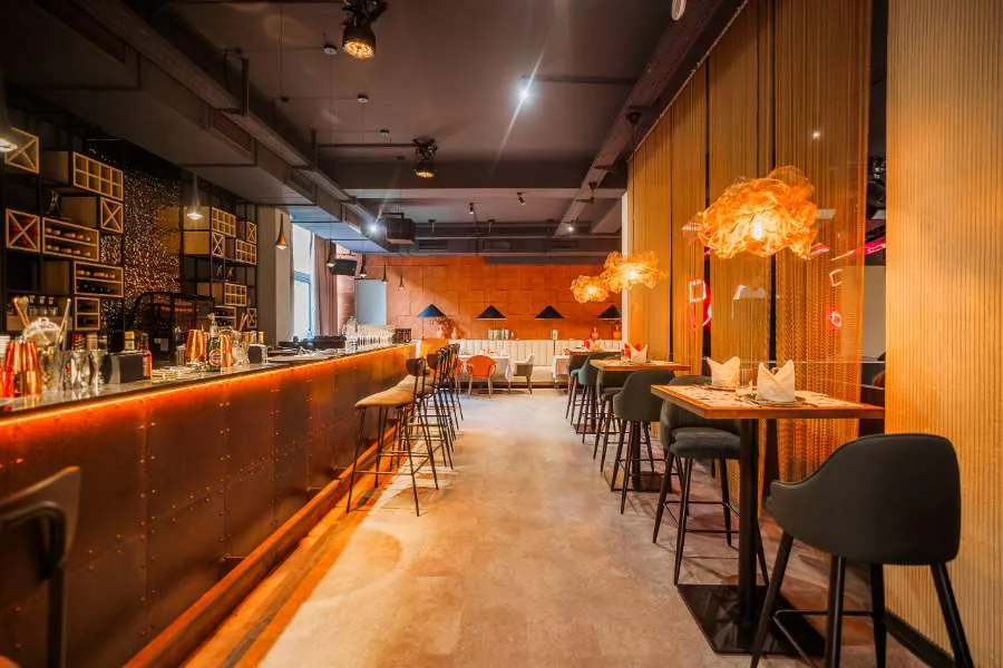
The room does most of the selling on its own: low light, warm brass, a wall of vinyl records behind the bar. The site's job was to stay out of the way of that and answer three questions fast: is it open, where is it, and can I get a table.
Functional requirements
- Hours, address, and a tap-to-call number visible without scrolling
- One-page structure: menu, drinks, events, and reservations reachable from a single scroll
- A reservation path that works with just a phone number, no account required
- Editable by the owners: seasonal photography, hours, and events without a developer
Non-functional requirements
- Fast enough on mobile data despite full-bleed, high-resolution photography
- Legible over photography at every screen width, not just desktop
- No dependency on me for routine content changes after handoff
Visual direction
Let the room talk
Every section is built around a full-bleed photograph of the actual space, not stock imagery: the goal was for a visitor to recognize the room the moment they walk in. The wordmark borrows the same serif as the restaurant's own vinyl-record wall plaque, so the logo reads as part of the interior rather than a sticker placed on top of it.
Walkthrough
Six screens, six decisions
A screenshot explains a decision better than a description of one. Here is the live site itself, screen by screen, with the reasoning behind each choice, including the one that did not fully work out.
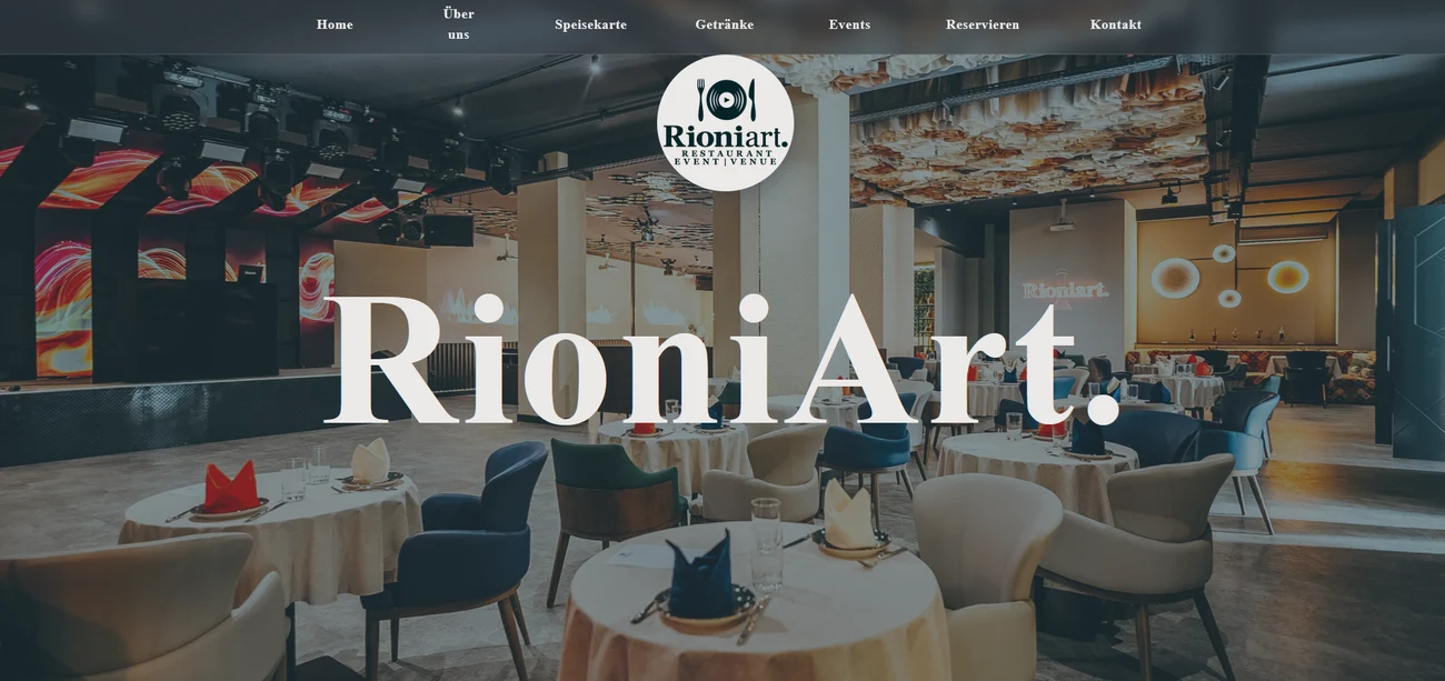
The homepage opens on the room itself, full-bleed, with the RioniArt mark laid directly over the photo rather than sitting in a header bar above it. Navigation is a single icon in the top right instead of a spread-out menu bar: the fewer chrome elements competing with that first photograph, the faster it reads as a real place and not a template.
The homepage pitch is short on purpose, so the actual restaurant story, in German, gets its own page instead of getting squeezed under the reservation call-to-action. It opens with a greeting in Georgian, GAMARJOBA, before switching to German for the rest of the text, a small signal of what the place actually is before a single dish is mentioned. Layout is plain: text on the left in the same serif as the rest of the site, a real plated dish bleeding off the right edge instead of a banner photo. It is also the longest page on the site, so this exhibit shows just the opening; click it to see the whole thing.
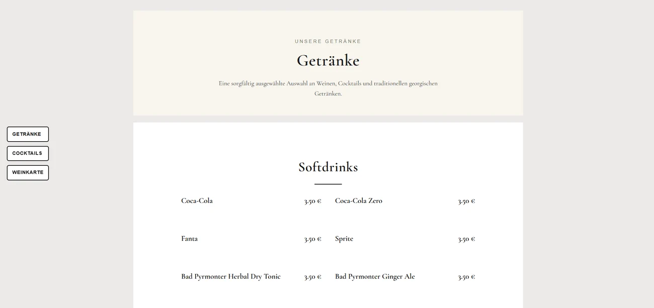
The full drinks list runs from soft drinks and coffee through wine, cocktails, and a proper spirits shelf, well over a hundred lines by the time you reach the whisky. Rather than one long undifferentiated table, each category became its own simple two-column list, name on the left, price on the right, with a thin rule to separate one category from the next. Nothing clever, but it is the difference between a menu someone can actually scan and a wall of text.
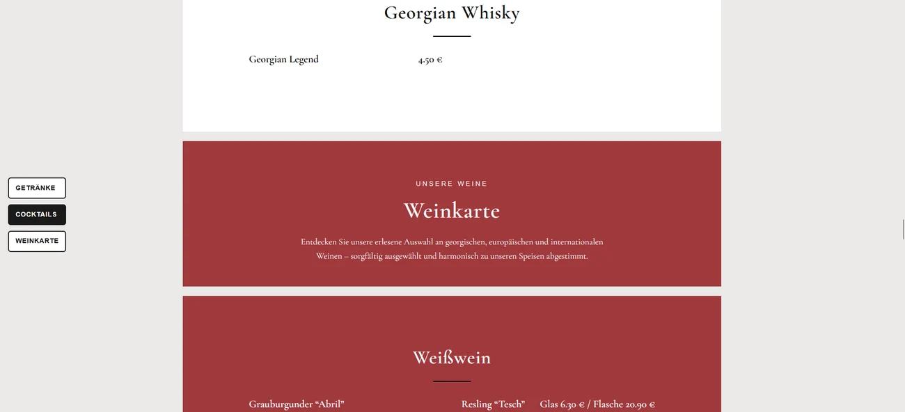
A list that long needed a way out of scrolling past forty lines of spirits just to find the wine. These three buttons on the left, Getränke, Cocktails, Weinkarte, are plain anchor links to the start of each category, pinned in view as you scroll down the page. It is a small addition, but it turns one very long menu into three short ones a guest can actually jump between.
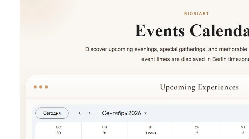
The events page is a Google Calendar, embedded, not a WordPress post type. The owners keep a shared calendar and add an evening straight from their phone's calendar app, the same way they would add any other appointment, and it shows up on the site within minutes with no login and no Elementor involved. It is a smaller piece of engineering than it looks: a single calendar embed link with the chrome (title, tabs, print button) turned off, tucked into an otherwise plain page.
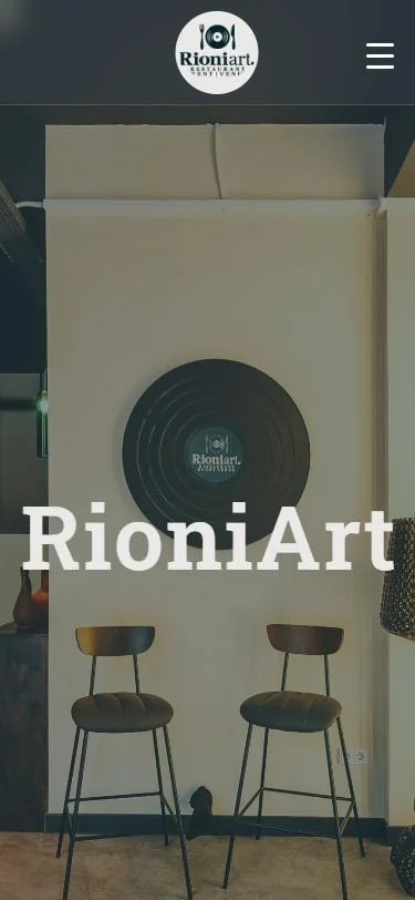
At phone width the same layout holds: one navigation icon, the room itself full-bleed, the wordmark centered over it. Little was redesigned for mobile so much as confirmed to still work there, since most people finding a restaurant at 8pm are doing it from a phone, not a laptop.
Build
One page, built to be edited
The whole site is a single scroll on WordPress with Elementor, not because a page builder is exciting, but because the owners needed to swap a photo or update a holiday closing themselves at 11pm without calling me. Navigation collapses to one menu icon under 768px, and the hours-and-location block sits high enough that it never needs a second tap to find.
Iteration
Soft launch, then a rewrite of the middle
Soft launch
The first version shipped with the structure I had planned: hero, about, menu, drinks, hours. Within a week the owners were fielding calls asking about private events, a use case the original brief never mentioned.
→ Missing: events & private bookingsAfter the first week
I added a dedicated Events section built around catering photography from opening night, plus a second call-to-action next to Reservations so a corporate booking does not get lost under table-for-two traffic.
→ Events added · booking calls split cleanlyOutcome
Where it landed
The site is RioniArt's main online presence today: the page people check before they call, and the first result when someone searches the name after walking past. It is a smaller project than the case file above it, but it shipped, it is live, and the owners run it themselves.