Hannover Medical
School
A mobile application that bridges analog spirometers and modern clinical systems, helping elderly patients with chronic respiratory conditions record and transmit their breathing data without friction, error, or delay.
Brief
The problem
Most patients managing chronic respiratory conditions still use analog, non-Bluetooth spirometers. Every reading has to be copied out by hand (into a notebook, a phone call, a photo texted to a nurse) before it ever reaches a clinician. That hand-off is where the data gets lost, delayed, or garbled, and it hits elderly patients hardest.
Working with the Department of Respiratory Medicine and Infectious Diseases at Hannover Medical School and lung-transplant researcher Dr. Jan Fuge, I set out to design a mobile app that closes that gap, without asking patients to buy new hardware or learn a complicated system.
“Analog devices remain dominant in at-home respiratory care: any real solution has to meet patients where they already are.”
Research
Listening before designing
I combined desk research on spirometry and digital-health regulation with two structured surveys (one for 57 patients, one for practicing clinicians) plus a benchmarking pass over existing respiratory apps (MIR Spirobank Smart, NuvoAir Home, AsthmaMD). The pattern across all three methods was the same: tools built for Bluetooth devices, and everyone else left to improvise.
On the clinical side, 67% of professionals said they still receive spirometry values by email, and a further quarter by personal hand-over: a workflow with no standard format, no timestamp guarantee, and no confirmation loop. Data security ranked as the single highest priority across both groups.
Personas
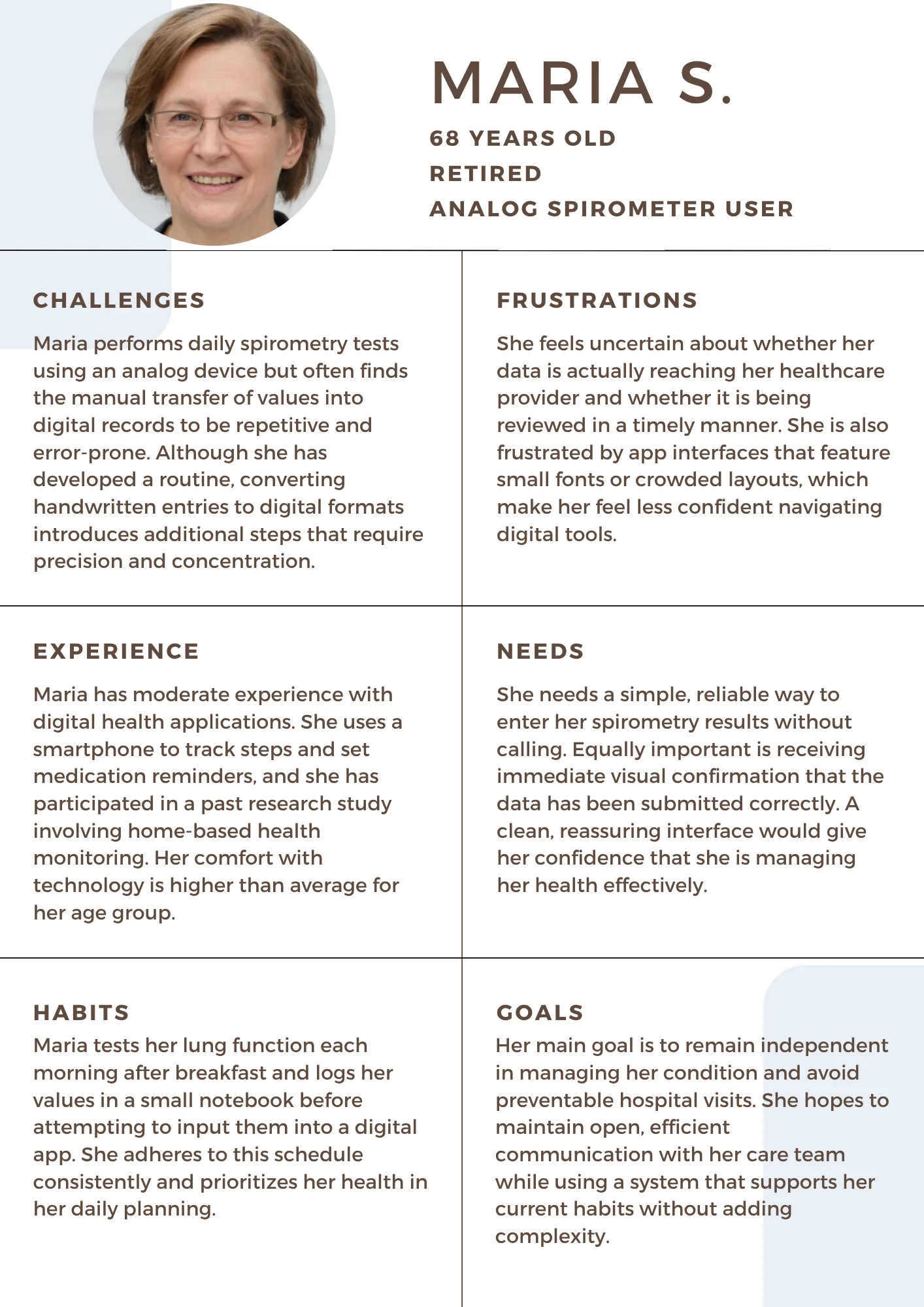
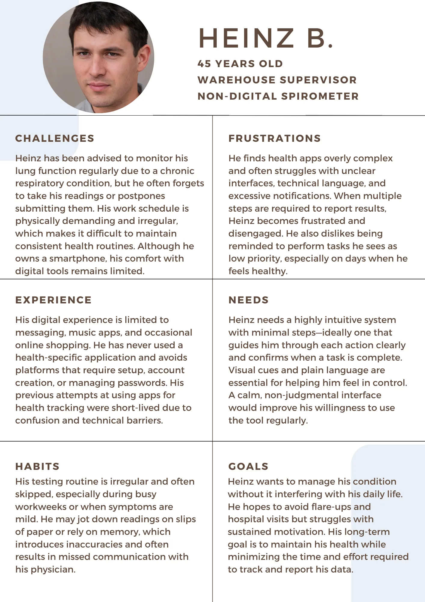
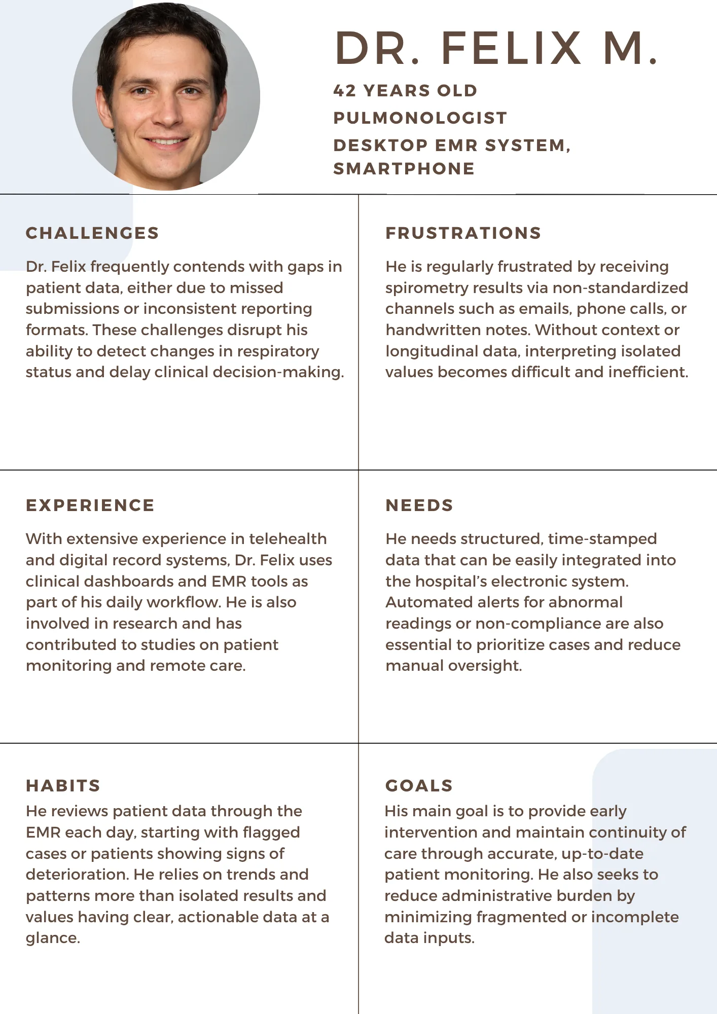
Three people, three sets of needs
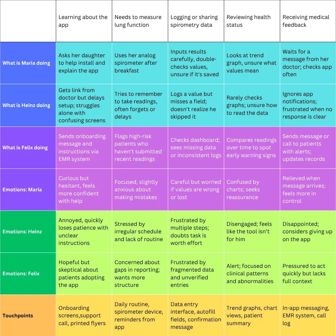
The research made it clear this wasn't one user group with one set of needs: it was three, each pulling the design in a different direction: reassurance, minimal friction, and clinical rigor.
Mapping the system
Stakeholders & journey
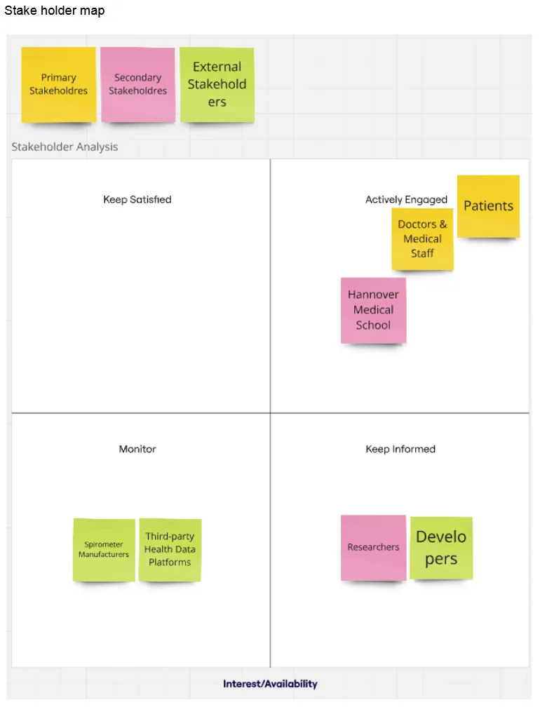
A stakeholder analysis placed patients, doctors, and Hannover Medical School itself in the “actively engaged” quadrant: the group whose needs had to be prioritized first. Developers, researchers, and device manufacturers sit further out, informing the roadmap rather than the first release.
Design direction
What the app had to do
Two "How Might We" questions anchored every decision from here on: how to design alerts patients would actually notice, and how to keep people using the app once they start feeling fine. Both pushed the requirements list toward accessibility first, automation second.
Functional requirements
- Manual data entry for PEF, FEV1 & PVC values
- Automated reminders & alerts for abnormal values
- Secure, encrypted data transmission
- Visual result history for patients & providers
- Export / sync capability with EMR systems
Non‑functional requirements
- Interface optimized for elderly, low‑digital‑literacy users
- Large text, high contrast, screen‑reader support
- Minimalist onboarding with clear, repeatable guidance
Ideation
Sketching a lot, fast
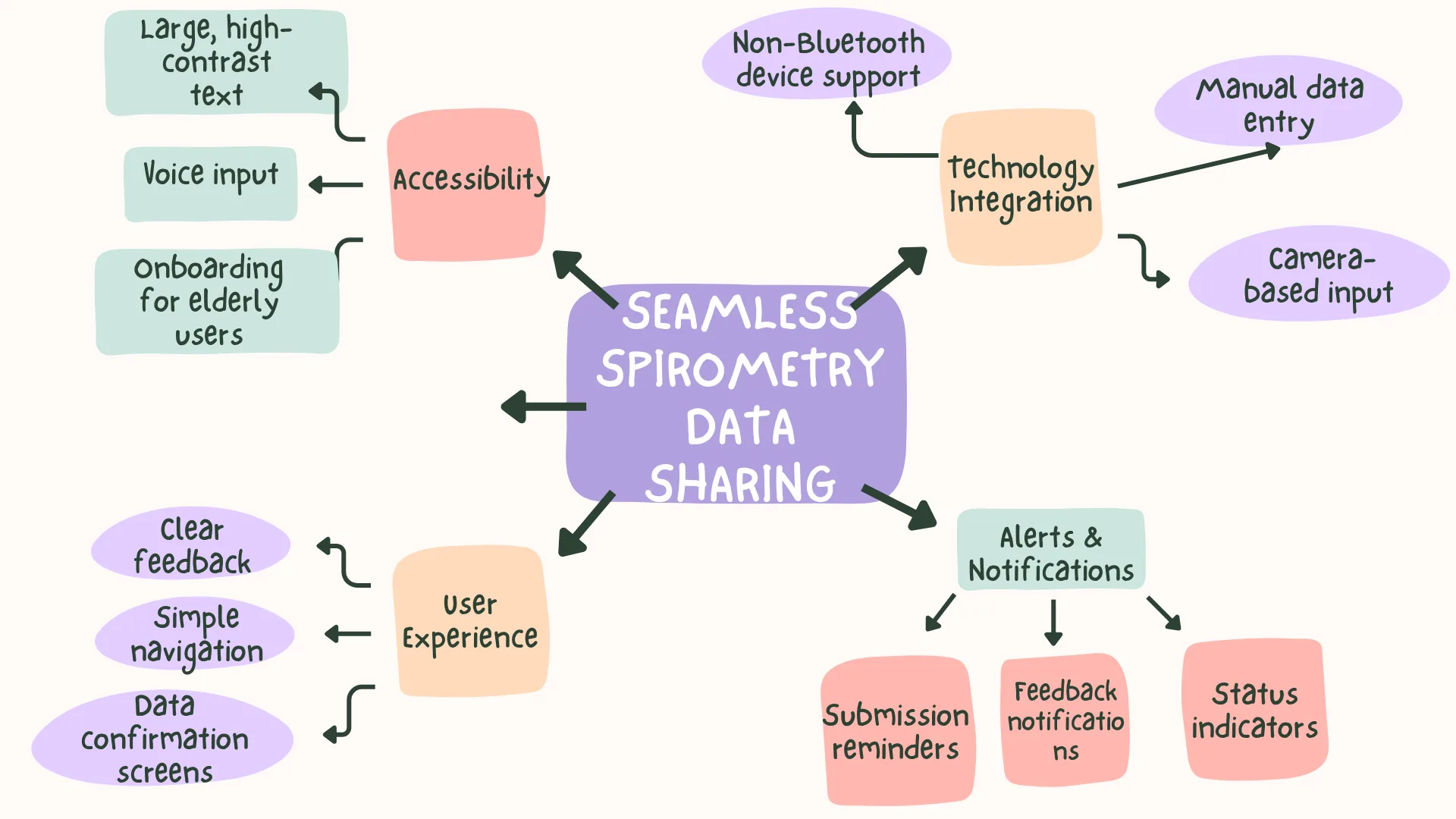
A mind map organized the research into four themes: user experience, technology integration, alerts, and accessibility. From there, three Crazy 8s sessions (with Dr. Fuge, the project's developer, and a group of fellow UX/UI students) and two Creative Matrix workshops turned those themes into concrete feature ideas, stress-tested from a clinical, technical, and accessibility angle in parallel.
“Motivation requires emotional and social design, not just functional tasks.”
Prototyping: low-fi
Structure before style
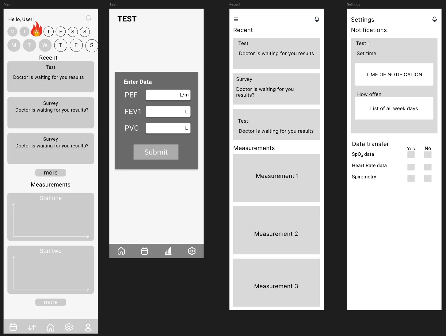
Wireframes came first, kept deliberately plain so feedback stayed about layout and task logic rather than color. The dashboard carries a streak tracker to fight the "I feel fine, so why bother" drop‑off clinicians flagged; a persistent bottom nav gives elderly users one predictable anchor across every screen; and the entry flow devotes one whole screen to one field, so nothing competes for attention.
Prototyping: high-fi
From flow to finished screens
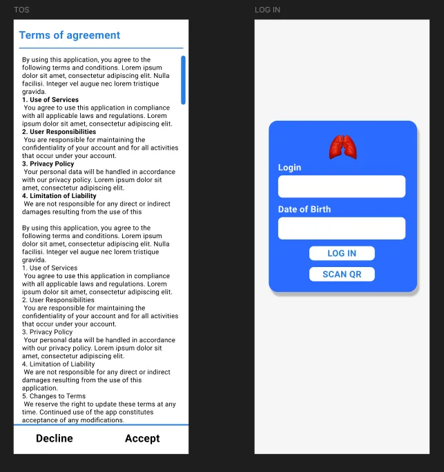
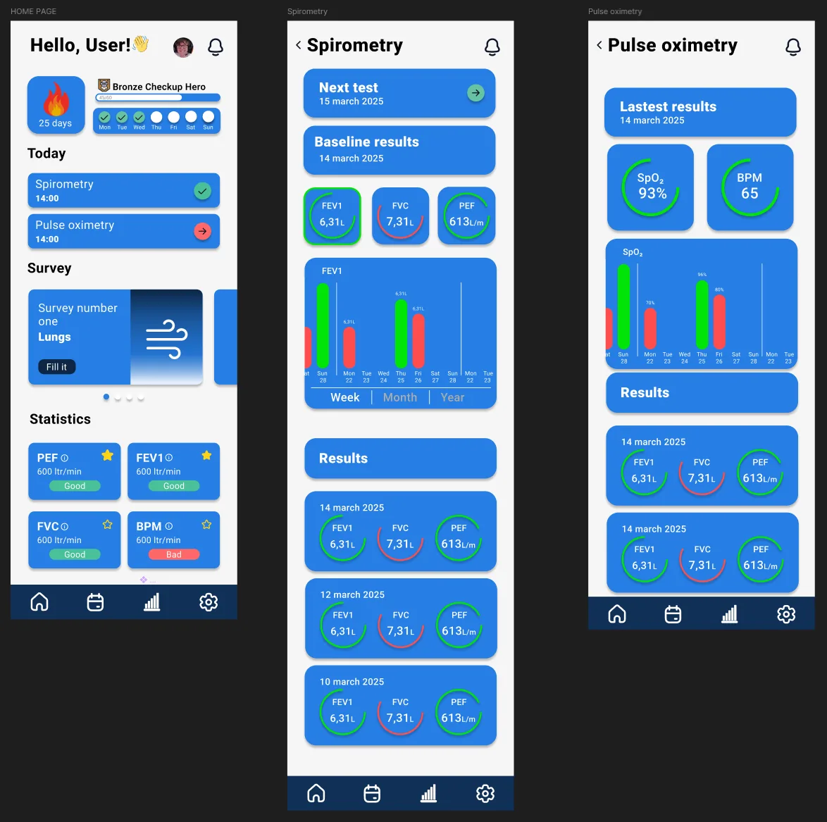
Login trades passwords for a date-of-birth check plus an optional QR scan for caregivers: a deliberate move away from an authentication pattern that survey respondents kept stumbling over. The home dashboard folds a streak tracker, today's tasks, and colour-coded FEV1 / FVC / PEF results into one screen, so nothing needing attention is ever more than a glance away.
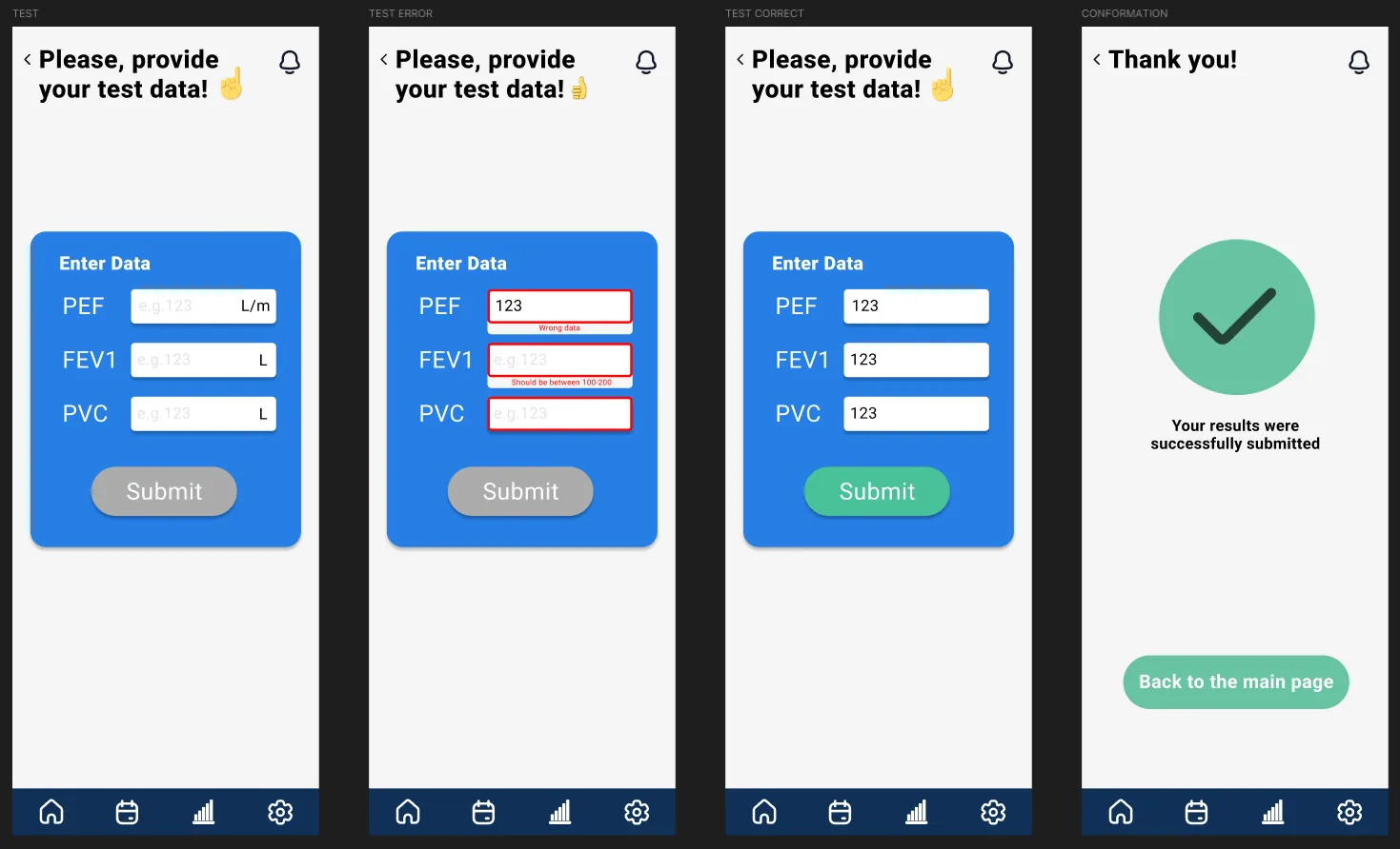
The submission flow is one field per screen: an empty state, an inline error state with a plain-language range hint (“should be between 100 and 200”), a valid state that turns the submit button green, and a confirmation screen with a large checkmark: small, deliberate moments of reassurance for a user who has just handed over medical data and wants to know it landed.
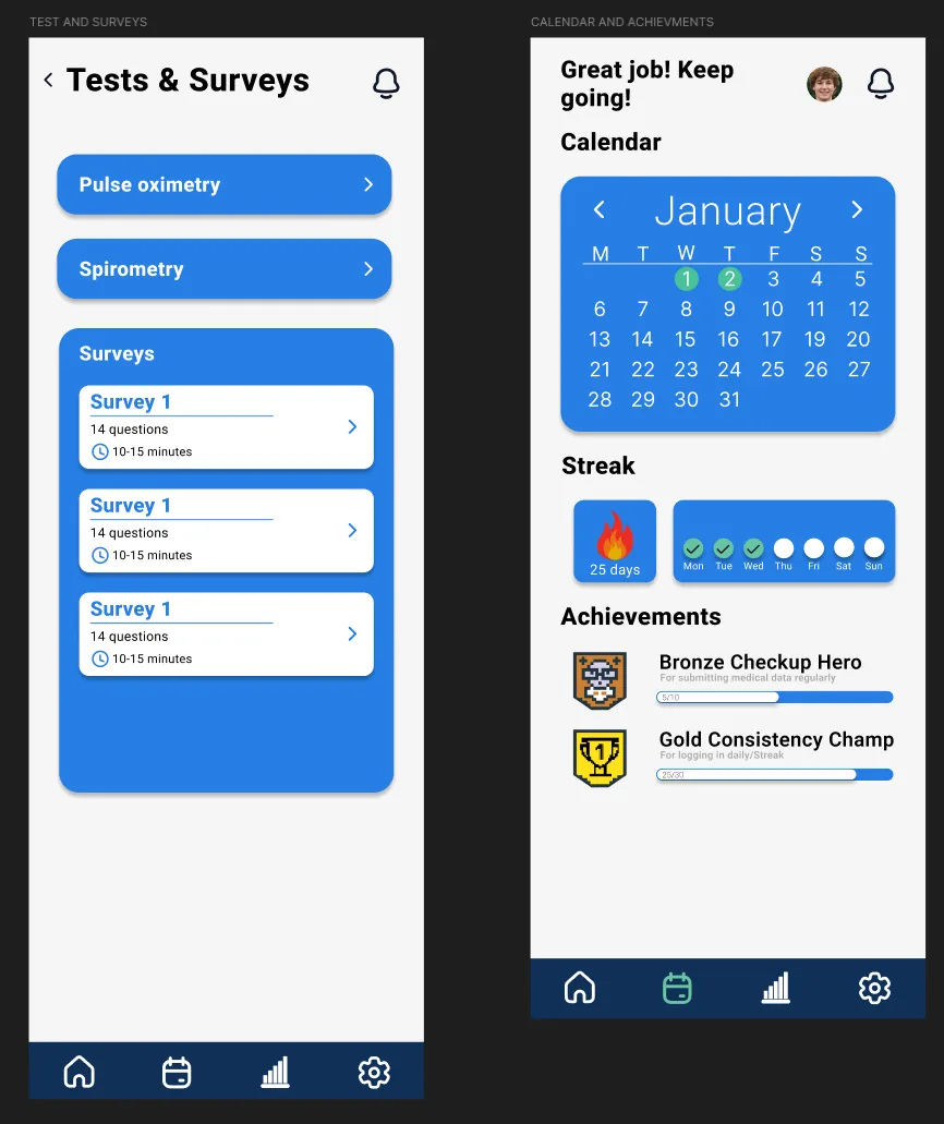
Achievements (a Bronze Checkup Hero badge for regular submissions, a Gold Consistency Champ for daily streaks) came directly out of testing: asymptomatic users kept saying they forgot to log data once they felt fine. The badges are deliberately small and light-touch, not a full gamification layer.
Visual system
Style guide
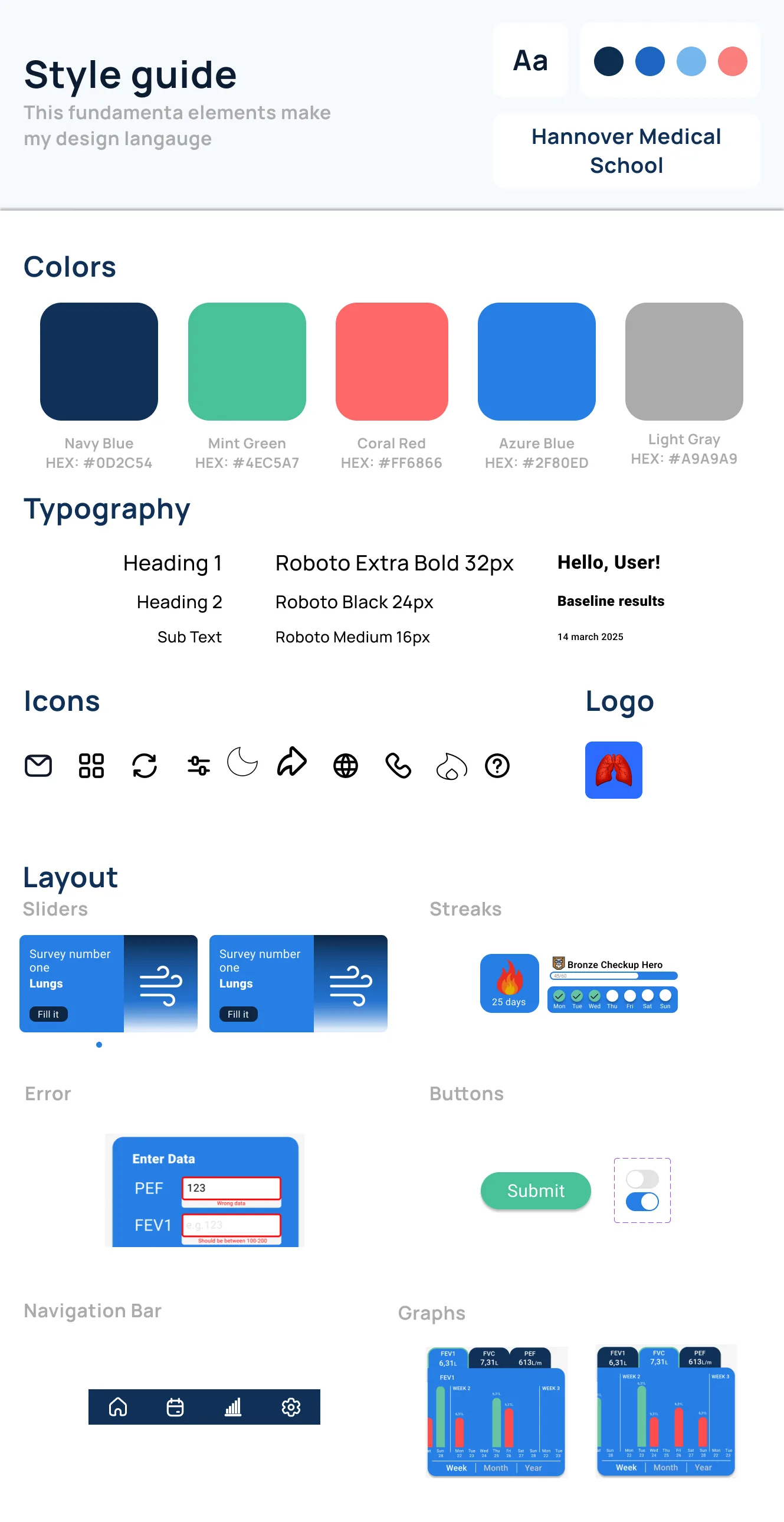
Navy, mint, coral and azure carry distinct meanings throughout the app: green for values in range, coral for anything that needs attention, layered over Roboto at three accessible weights and a minimum 18pt body size.
Testing
Two rounds, real users
Every session ran on the clickable Figma prototype with three participants: Dr. Fuge, two UX/UI designers, and one 69-year-old patient, a deliberate spread across clinical, design, and lived-experience perspectives.
First round
All six core tasks were completed by everyone, in 9-11 minutes on average, but the result graphs confused two of three participants, and one tester tapped a section header expecting it to act like a button.
The elderly participant needed light guidance for notifications and graph interpretation, and asked directly: “what if the number I enter is dangerous?” (a question the prototype had no answer for yet).
→ Charts unclear · no critical-value feedbackAfter iteration
Chart labels, baseline values, and consistent colour‑coding were added, plus a dedicated critical‑value alert screen and inline validation with exact error text.
In the second round every participant read their own history unaided, the elderly tester stopped asking for clarification altogether, and one tester said the correction prompt "felt natural, like the app caught my mistake."
→ No major issues remaining · ready for handoffOutcome
Where it landed
The finished high‑fidelity prototype gives elderly patients a low‑friction way to report analog spirometry results, gives clinicians structured, time‑stamped data instead of a phone call, and gave Dr. Fuge's lung‑transplant follow‑up programme a tool his patients responded to well beyond the numbers he expected.